IDEATION
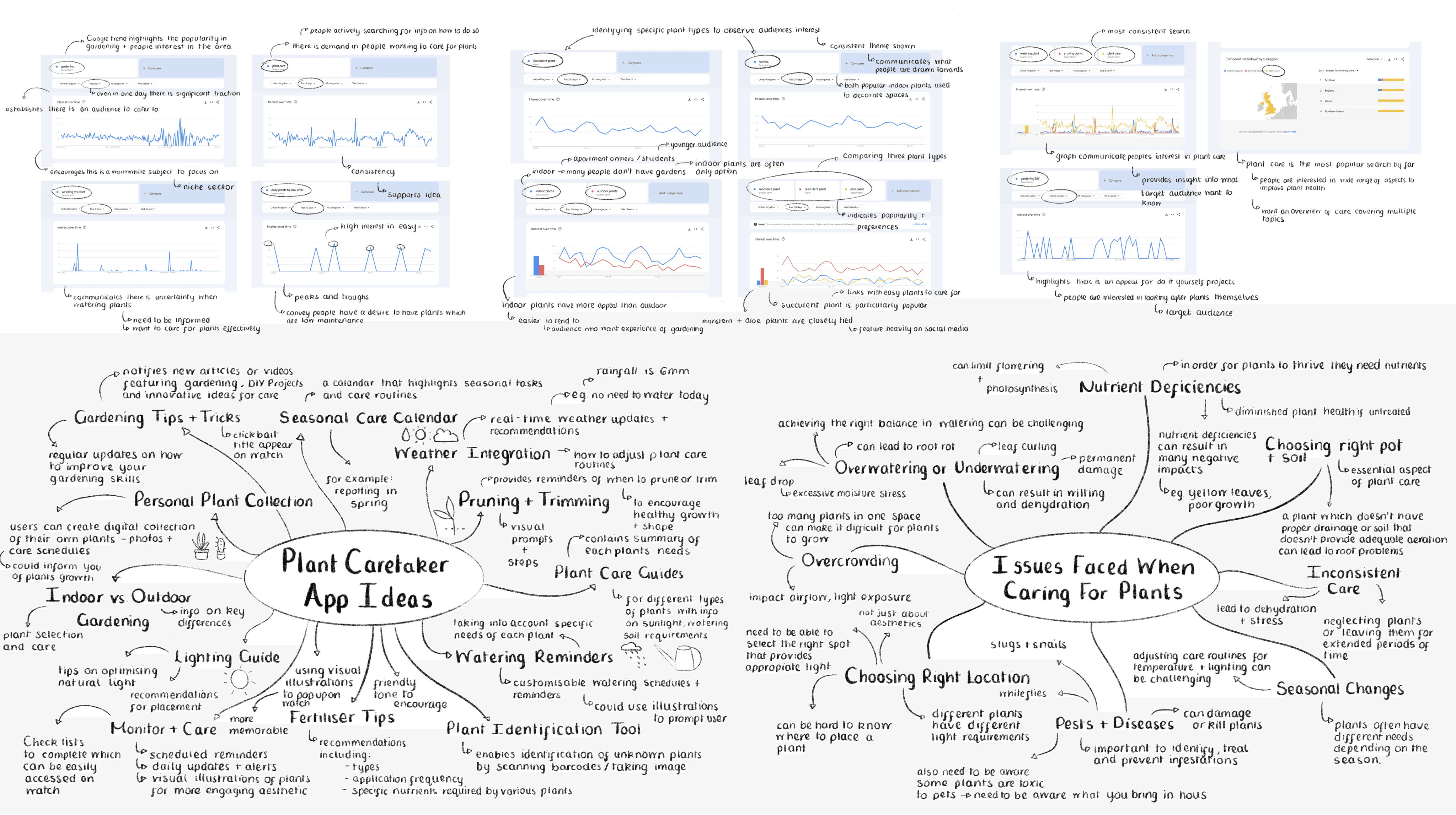
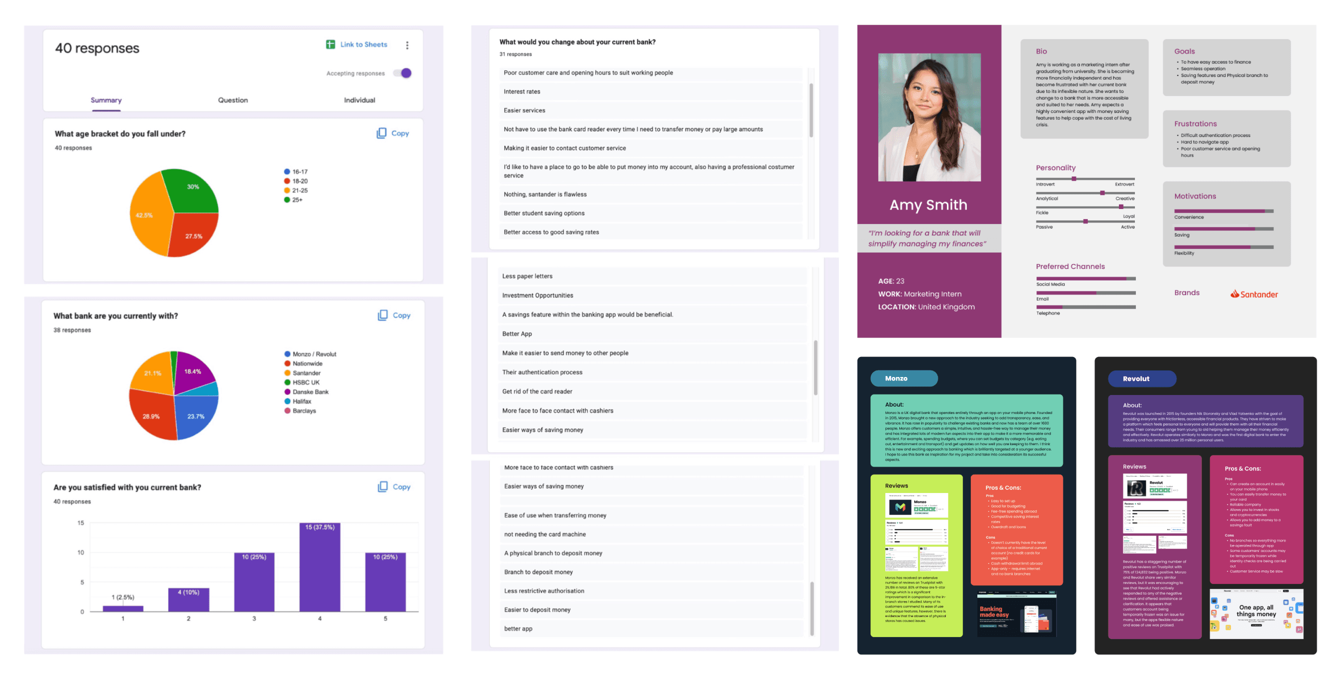
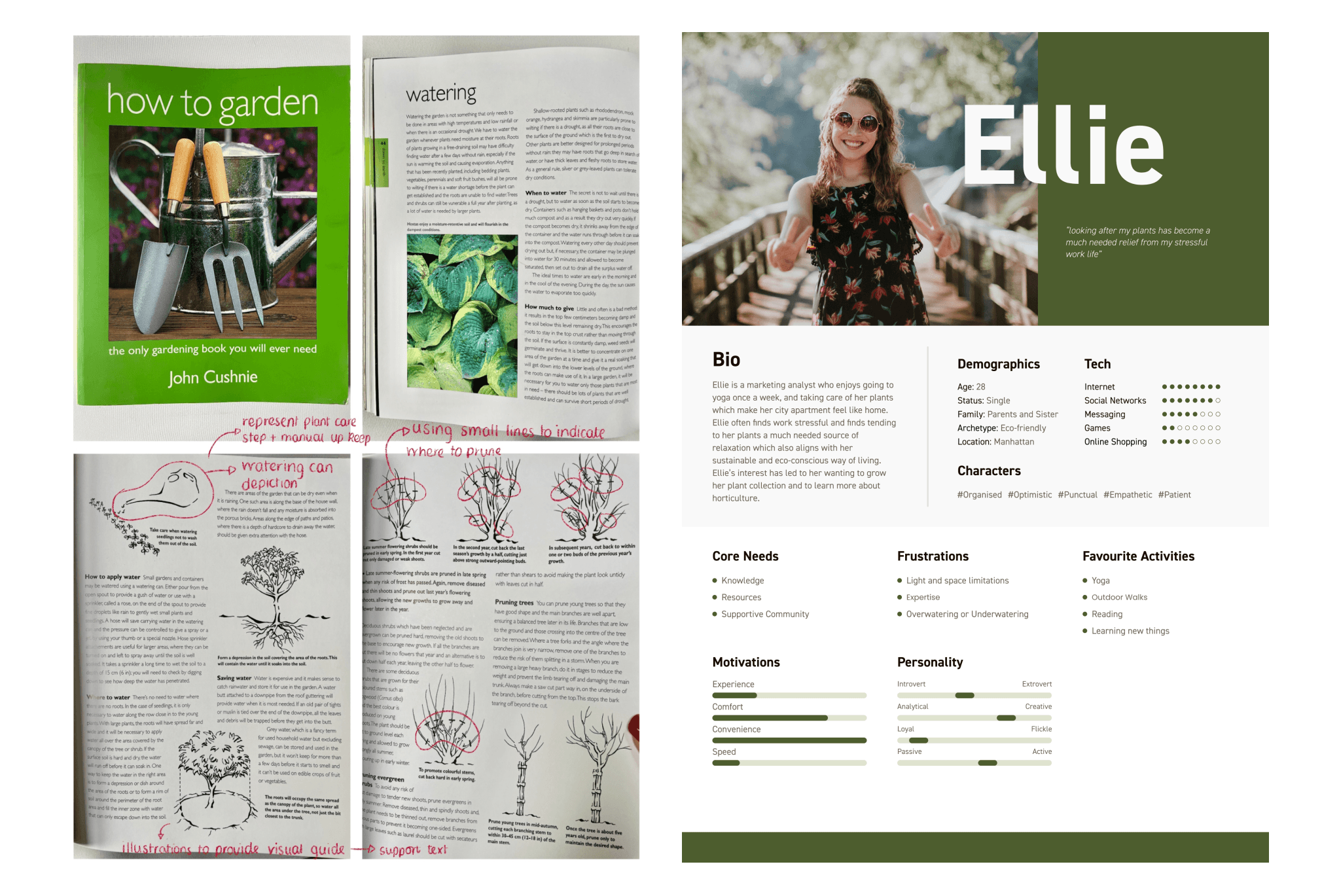
The next step was to gain greater understanding of my concept and target audience. I created a user persona to gain insight of a typical user needs, behaviours and preferences. This focused the aim of the project on informing users about plant care through tips and tricks, providing key care reminders, and enabling a tailored user experience that is friendly and simple. I studied various gardening books to acquire necessary knowledge on the subject area and to inform decisions on the apps content.
Research
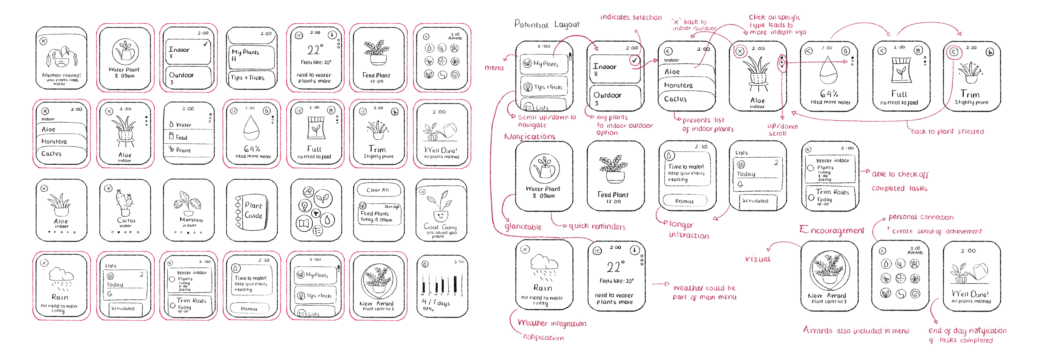
After thorough research, I sketched initial ideas for a plant care app designed for the Apple Watch. I drew inspiration from successful weather applications on the device and adhered to watch interface design principles. The process involved experimenting with various compositions and simplifying elements to suit the watch screen’s limitations. Choosing the most promising sketches, I created a coherent structural layout, focusing on the app’s navigational flow and integrating motivational notifications and rewards. I also considered incorporating weather information into the primary menu to enhance the app’s utility and user engagement.
sketching
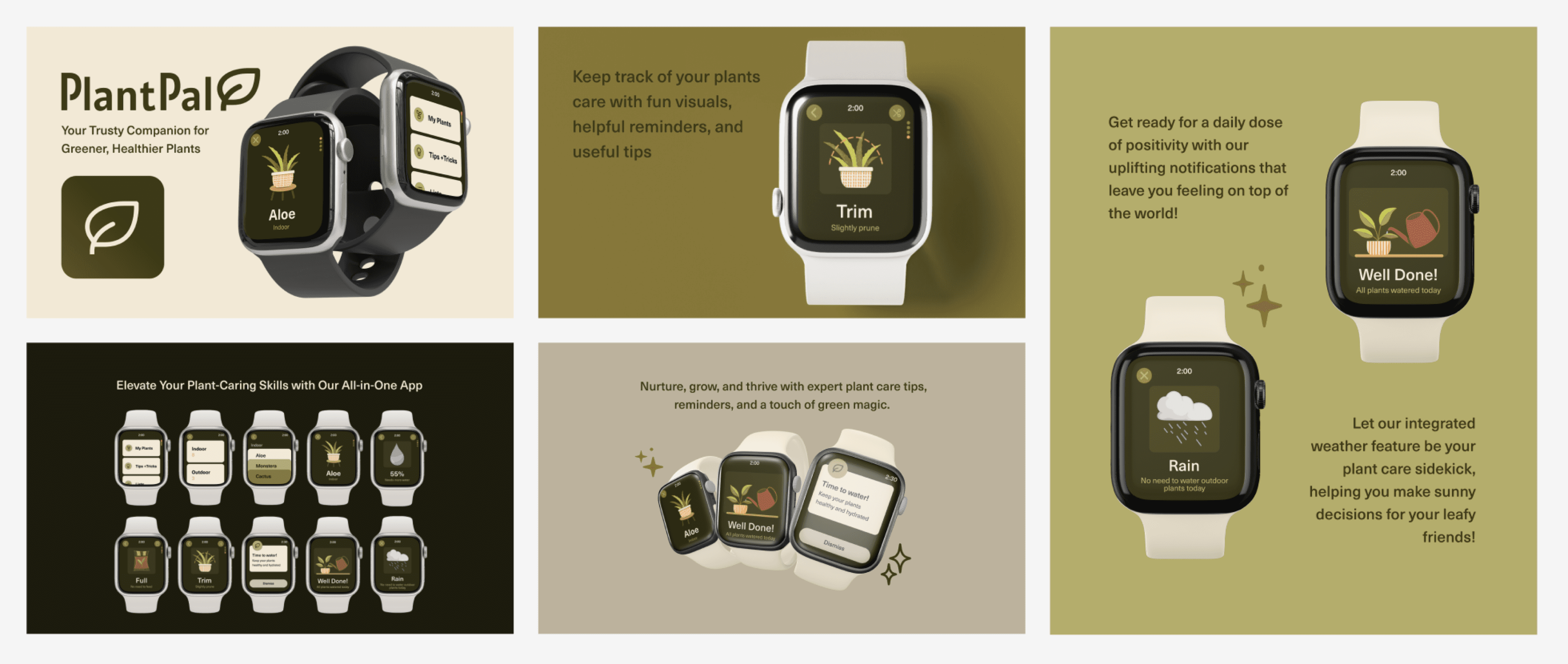
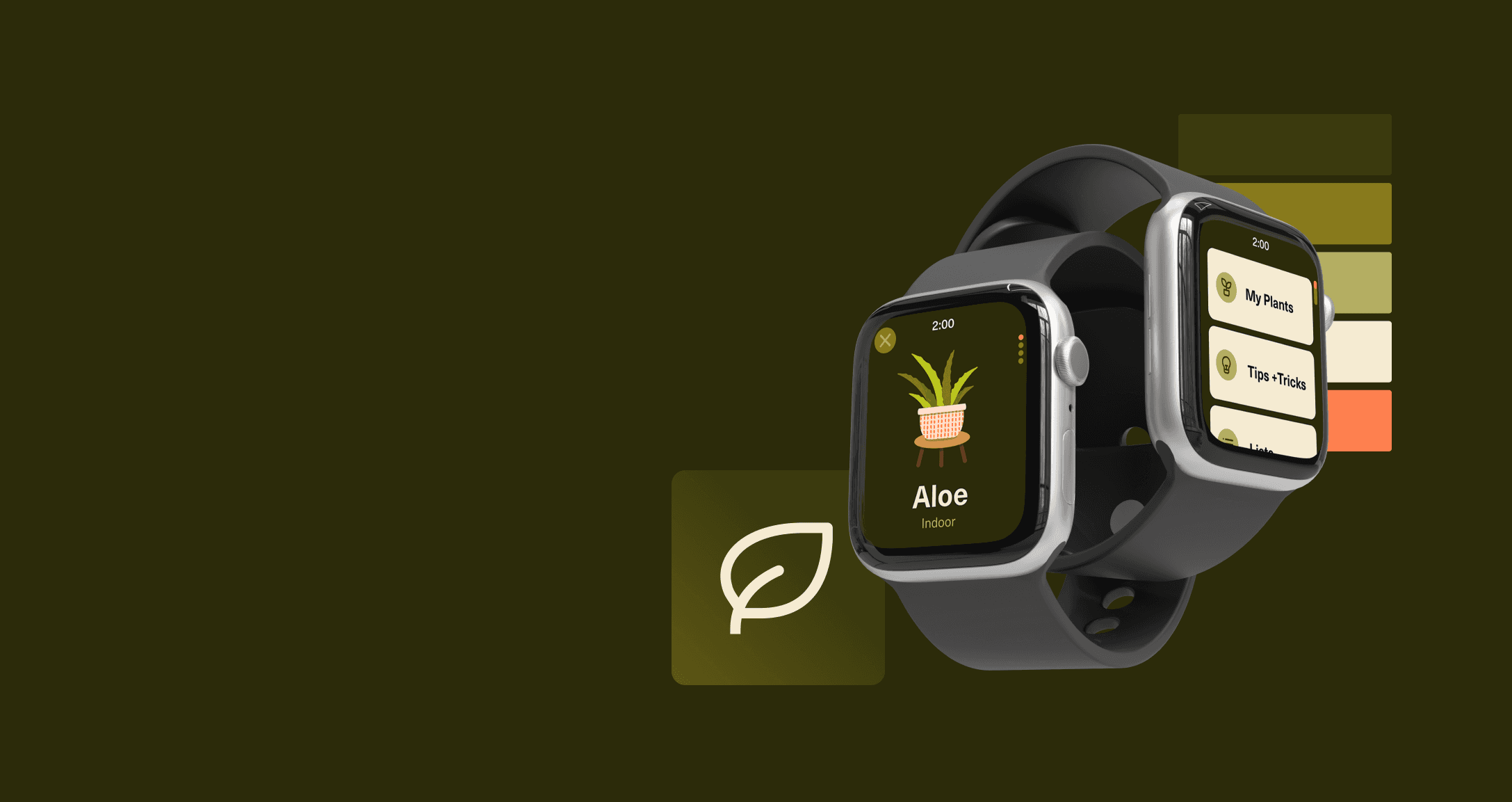
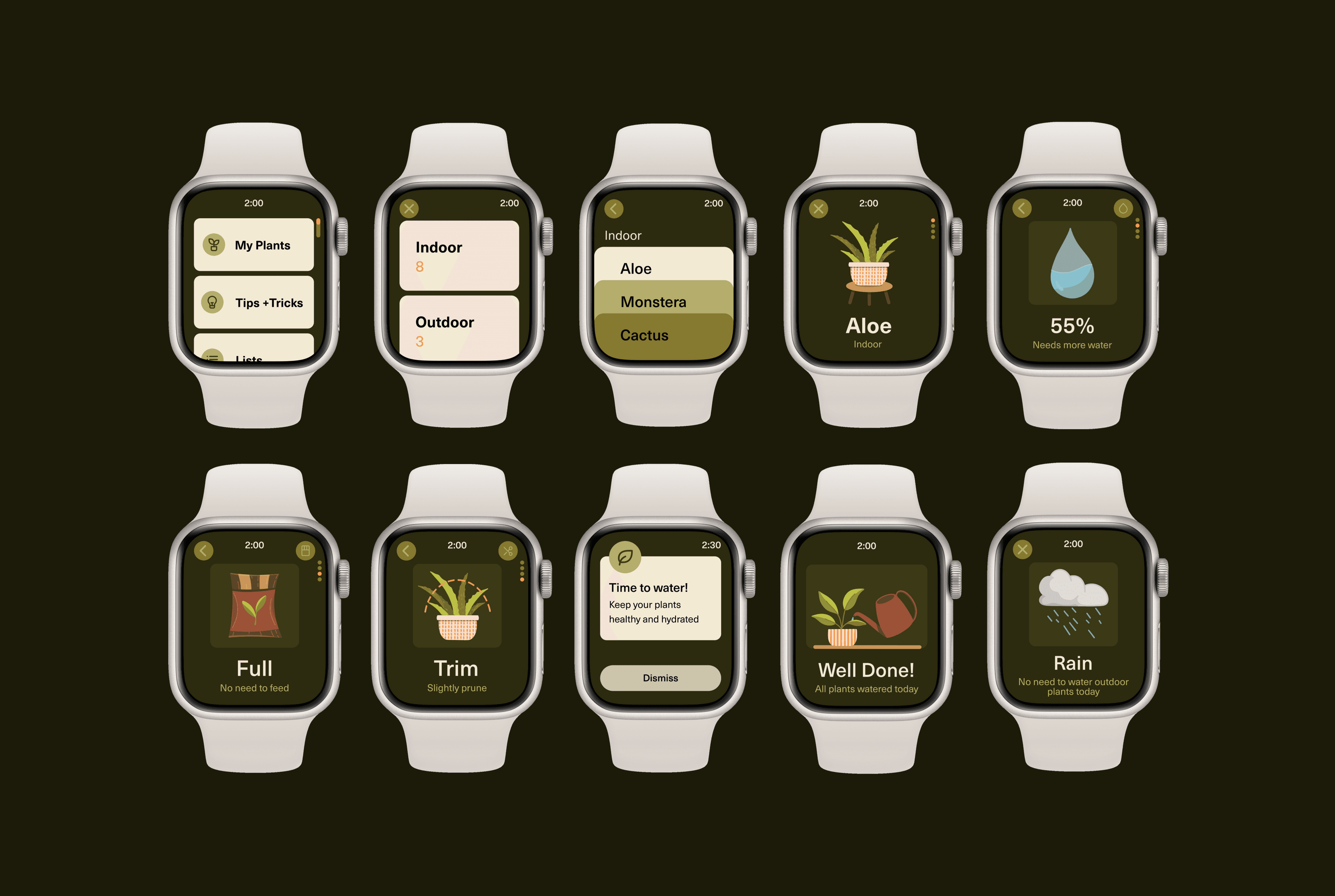
Starting with the refined sketches, I used Figma to create wireframes. In choosing a sympathetic colour palette, I used shades of green for backgrounds, icons and text, along with a light neutral colour for clarity, and a warm orange to serve for subtle user indicators. The UI embodies simplicity and minimalism; illustrations and the brand’s logo were integrated effectively, presenting concise information and easily digestible visuals. In protoyping, I connected the elements, creating a functional app representation with animations and scroll transitions, showcasing navigation and notifications.
digital development
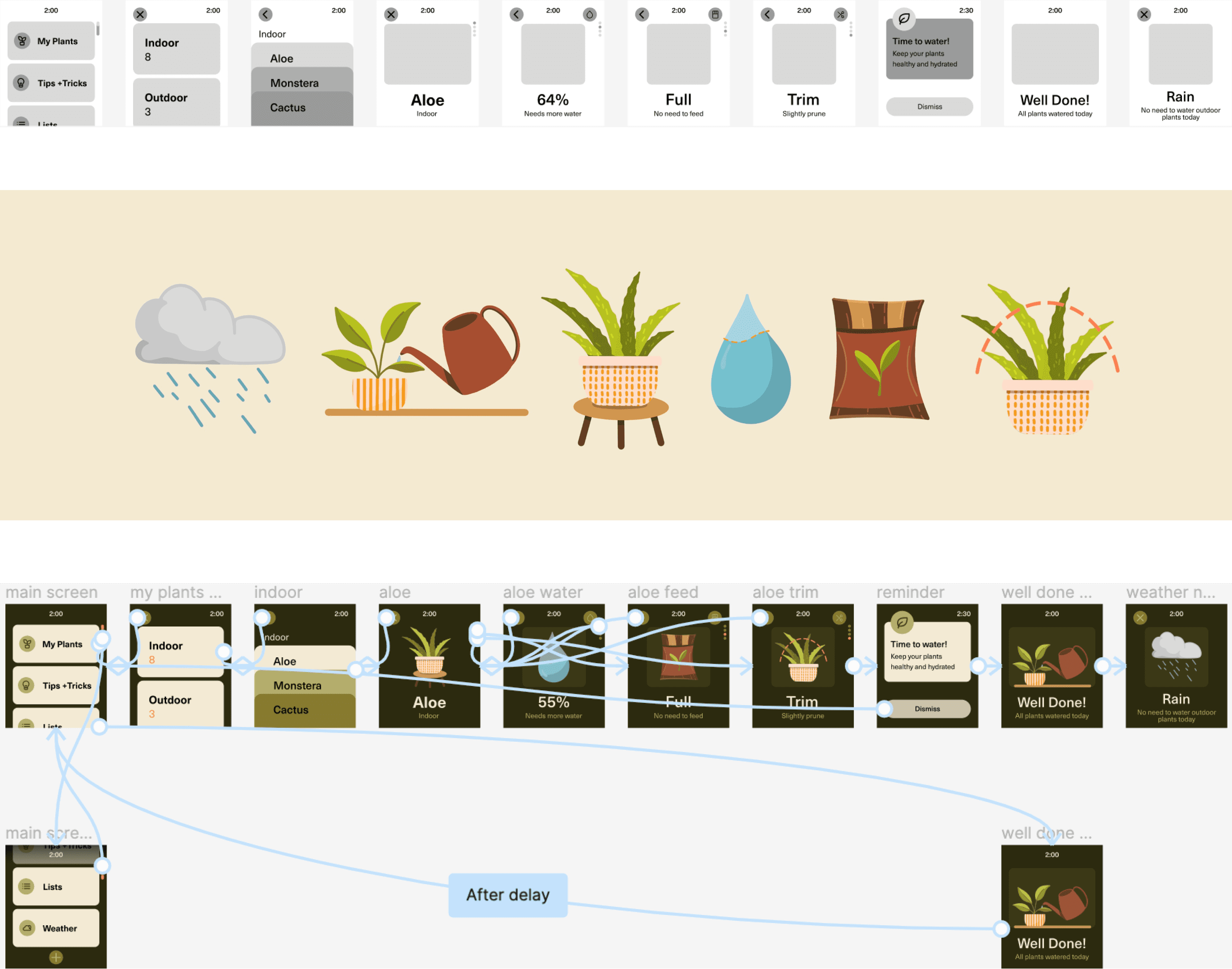
The simplicity of both the idea and corresponding design is deliberate, reflective of the subject, and devoid of embellishments to create an inviting and user-friendly experience. From my research, I determined that a simple design approach that did not clutter the screen effectively aligned with the principles of presenting essential and pertinent information.
The screens developed successfully conveyed the core purpose of my app, but have the potential to incorporate more comprehensive features if required. The notifications and reminders feature are particularly well suited to delivering succinct and easily comprehensible content – in a manner familiar to smart watch users. While there is room for further refinement within the brand, I am content with the progress achieved within the confines of a compressed timeline of two weeks for the project.
reflection
