Dashboard
Dashboard
Dashboard
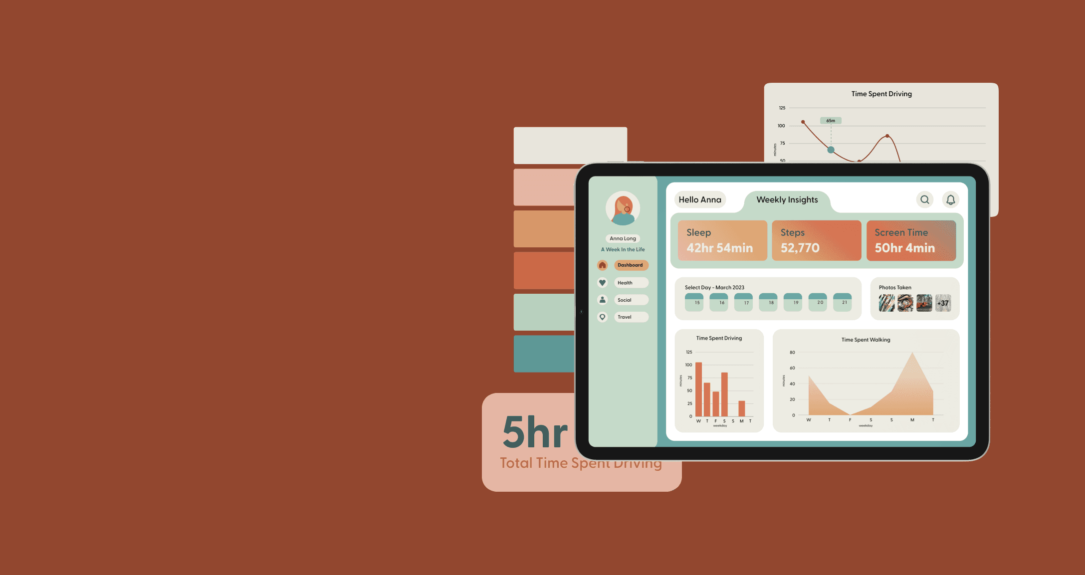


A user-friendly dashboard that offers a compelling overview, emphasising insights and engaging visuals.
A user-friendly dashboard that offers a compelling overview, emphasising insights and engaging visuals.
A user-friendly dashboard that offers a compelling overview, emphasising insights and engaging visuals.
About Dashboard
Demonstrating diagrammatic skill creating a user-friendly data dashboard that offers a compelling ‘Week in the Life’ overview. The goal was to highlight important trends and insights, using attractive visuals and interactive charts for easy data comprehension. It prioritised intuitive data presentation, providing users with swift, insightful access to their daily activities to assist them to make well-informed decisions about their daily and weekly habits.
ROLE
UX/UI Designer
TIMELINE
6 Weeks


DATA COLLECTION
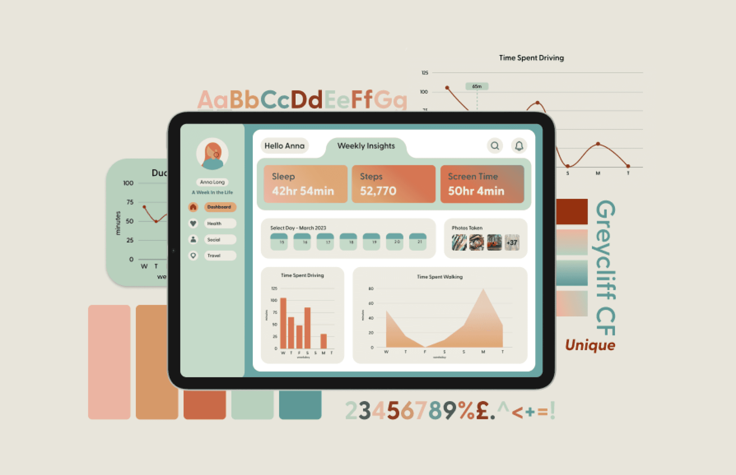
To initiate the project, I identified and gathered information on the specific areas I wanted to focus on for data collection, using a combination of written records, iPhone data and personal tracking data. I set parameters of collecting data every day for a week from which to analyse trends and patterns in my daily life.
DATA COLLECTION
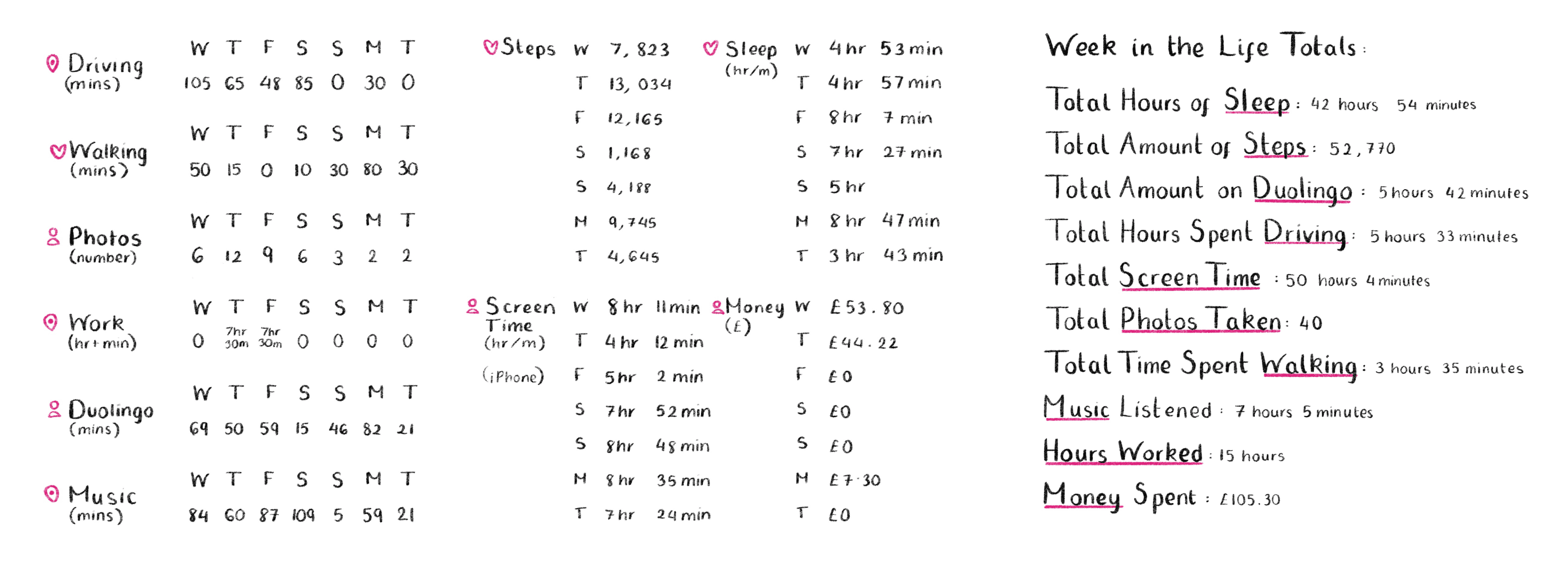
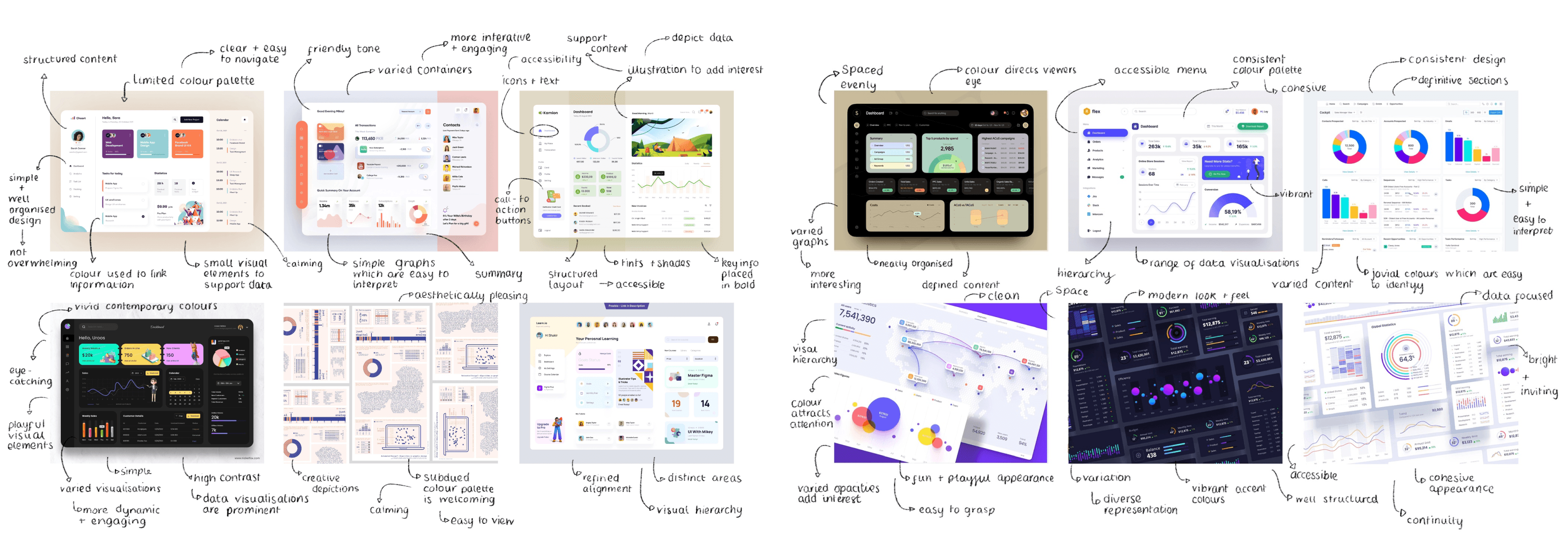
To design an engaging and effective dashboard, I researched and created mood boards displaying successful dashboard designs. Looking at different data visualisations, layouts, colour schemes and styles I identified that incorporating colour and using a diverse range of data visualisation styles played a significant role in highlighting essential information. I favoured those that used clean and accessible layouts, with distinctive sections accessed through icon-based menu bars.
Sketching
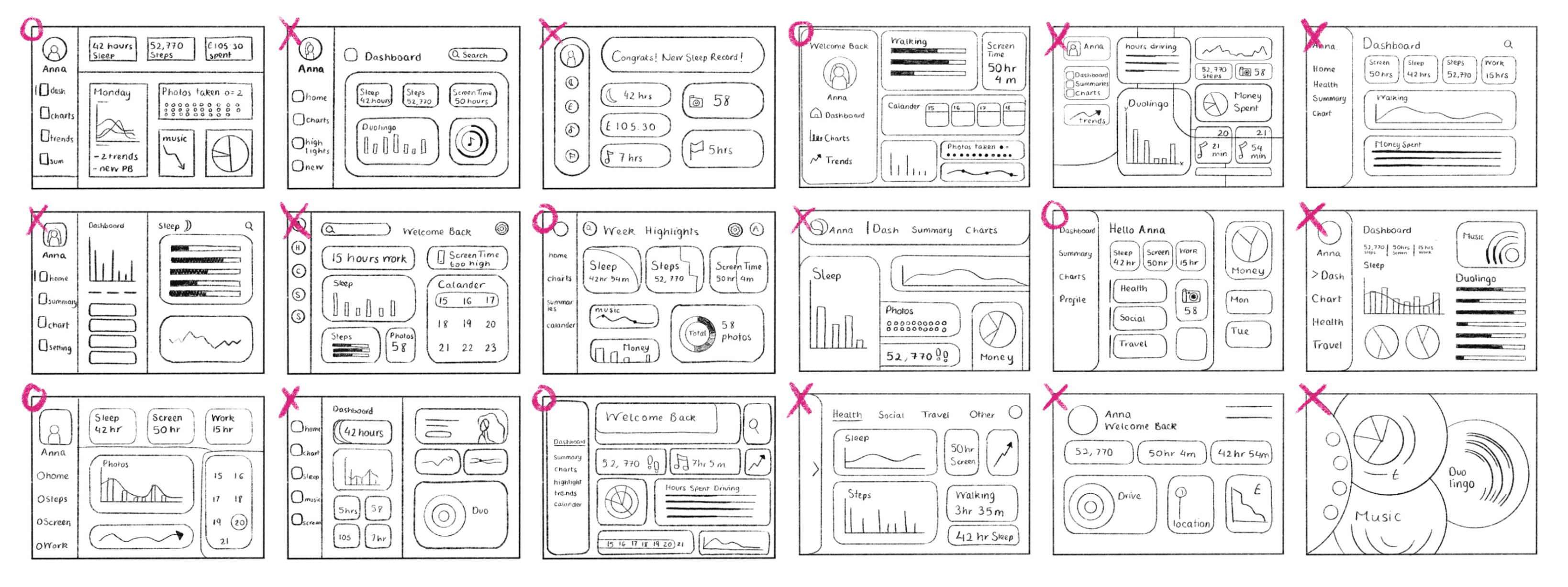
Using wireframe sketches to explore various dashboard layouts, I started with basic and minimalistic compositions to understand the design process, drawing inspiration from my mood boards, and trying to replicate successful features I had identified. Using wireframes enabled me to experiment with layout, alignment and the arrangement of key data.

digital development
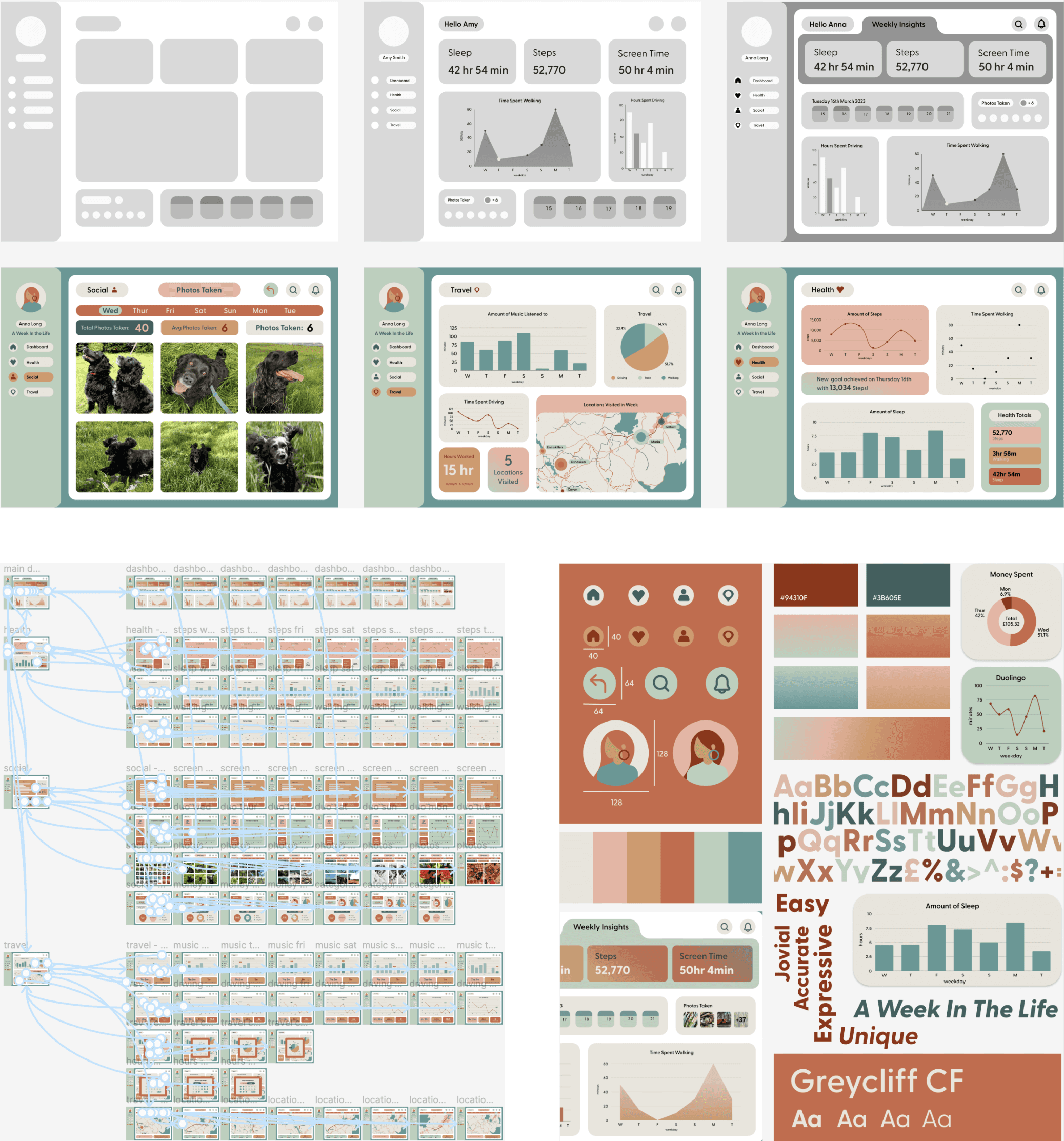
I created my dashboard in Figma. The main dashboard focused on presentation of data for specific days chosen from a calendar using line and bar charts for clarity. I refined the home dashboard by reorganising the content, adding titles and containers along with custom designed icons and simplified the data sheet to streamline chart creation and added different colours, prompts and highlights to engage users visually.
reflection
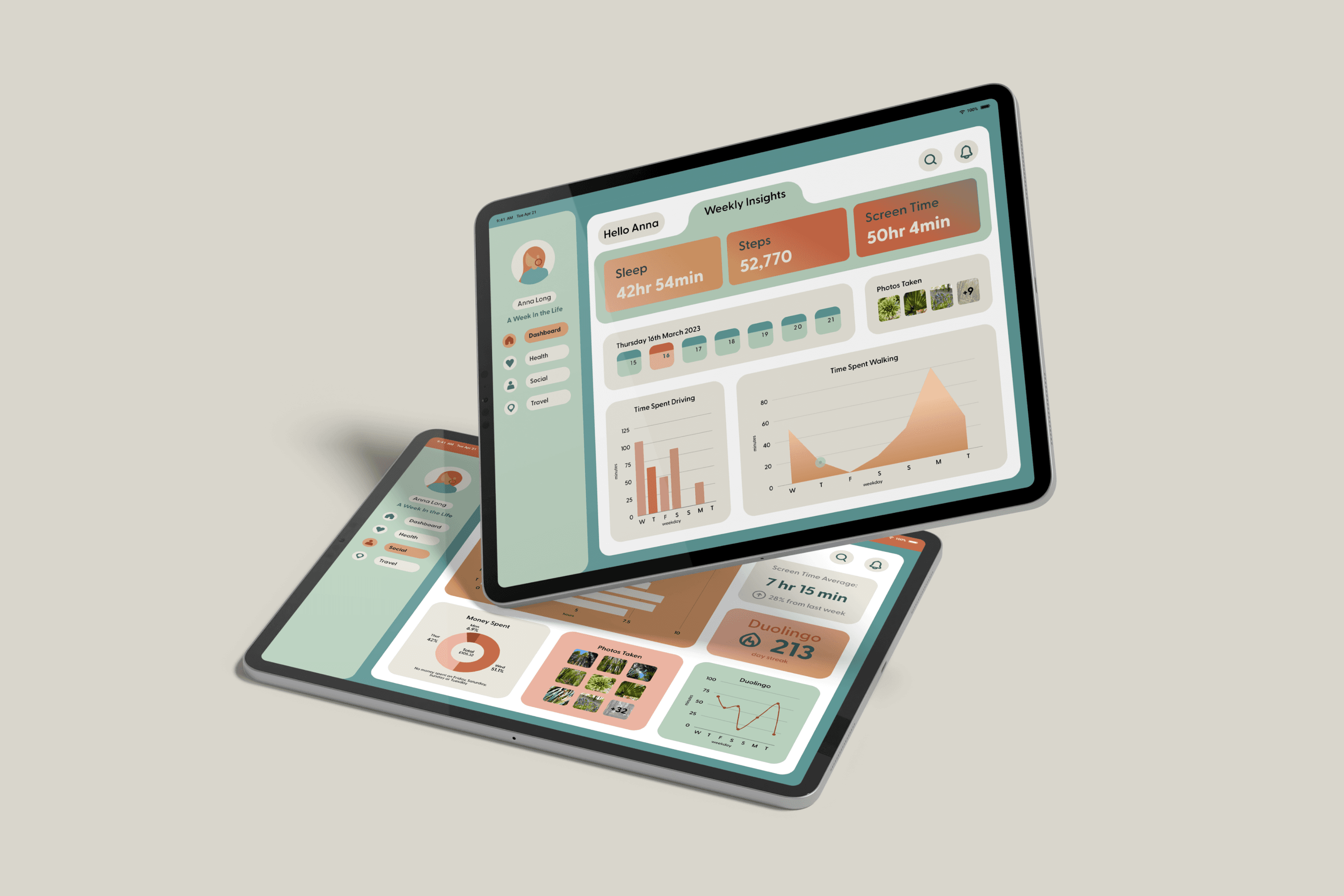
The project refined my design process, I learnt to be precise in getting core screens right initially to save time. While working with data and standard constituents such as graphs and charts was initially challenging, I enjoyed creating screens that captured additional information, such as locations and photographs. Had I collected more data initially, I could have created more visually engaging data presentations. Despite recognising these areas for improvement, I am content that the dashboard presented key information accessibly and consistently to reflect a week in my life.
Want to see more?
Want to see more?
Take a closer look at this project on my Notion blog
Take a closer look at this project on my Notion blog
Take a closer look at this project on my Notion blog
More work this way
Anna long
Currently studying Interaction Design at Ulster University Belfast.

Think I’d be a good fit for your team? Let’s connect.
anna.long0506@gmail.com
Email copied!
Selected projects
Anna long
Currently studying Interaction Design at Ulster University Belfast.

Think I’d be a good fit for your team? Let’s connect.
anna.long0506@gmail.com
Email copied!
Selected projects
Anna long
Currently studying Interaction Design at Ulster University Belfast.

Think I’d be a good fit for your team? Let’s connect.
anna.long0506@gmail.com
Email copied!
Selected projects
