Brand development
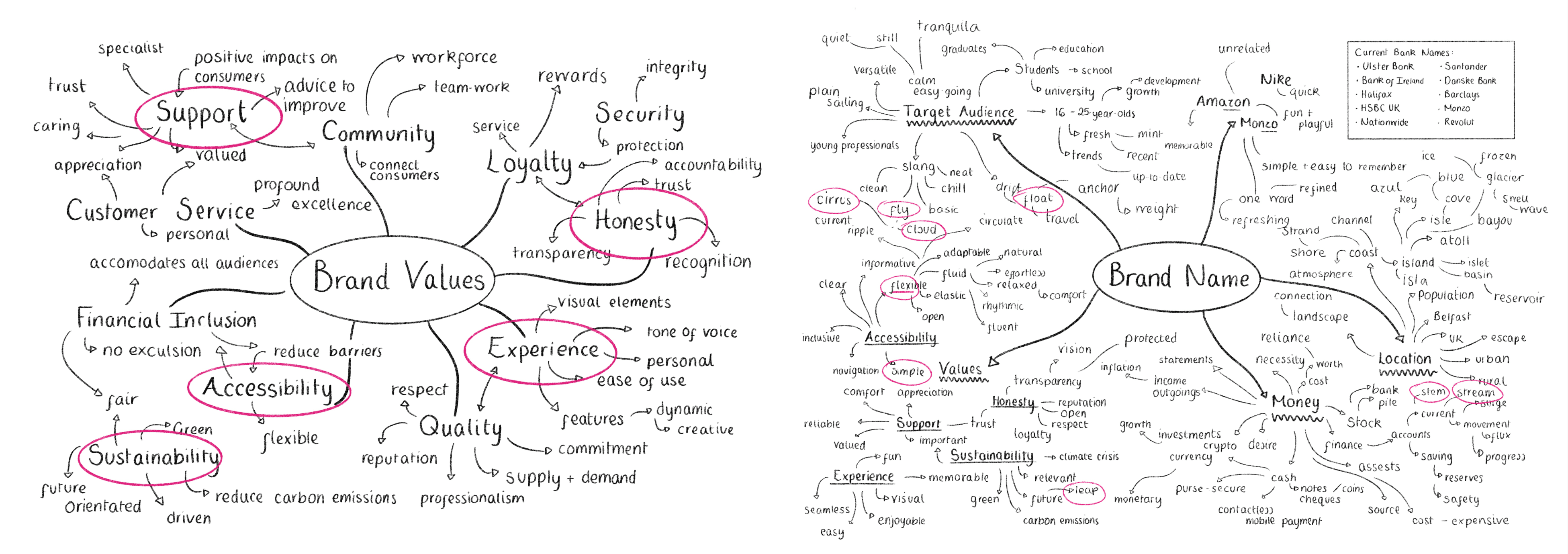
The next step was to define my values and name for the brand. These were determined through research into the target audience and competitor analysis. I selected the name Float due to its simplicity, relevance to finance, positive connotations, versatility and youthful appeal. The name effectively represents the bank’s mission and resonates with its target audience.
brand development
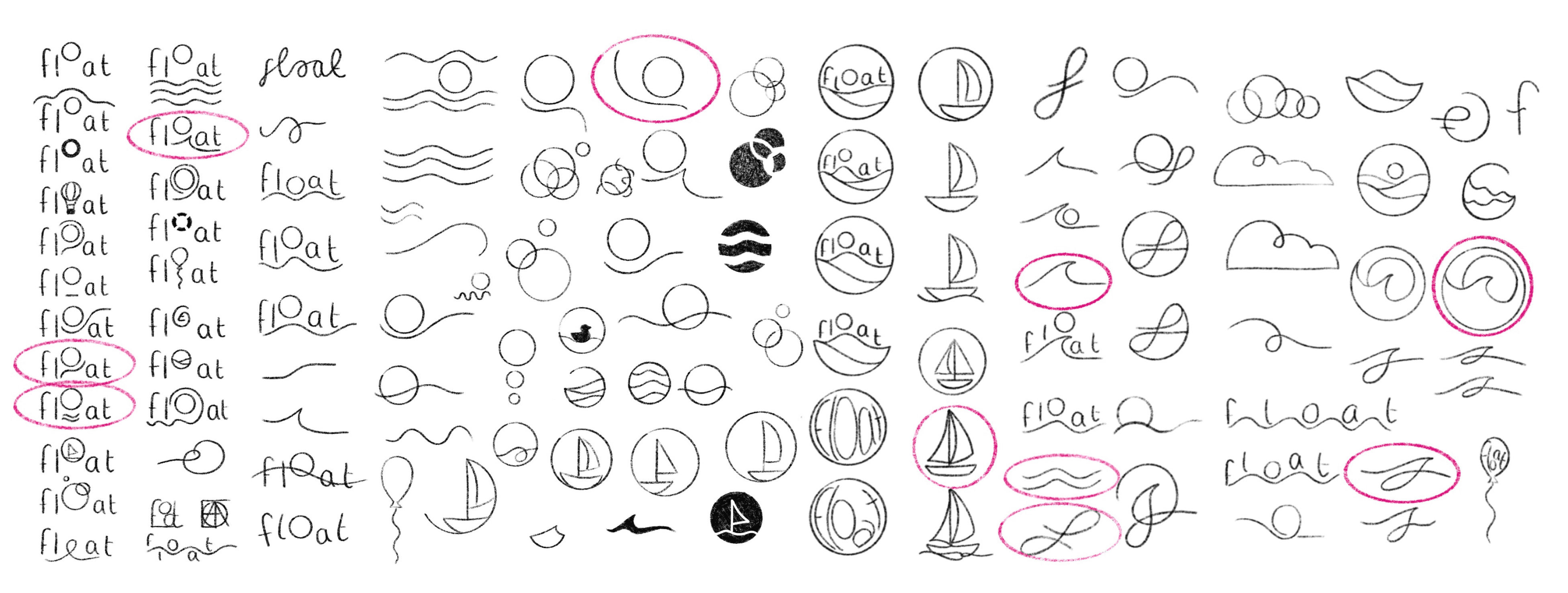
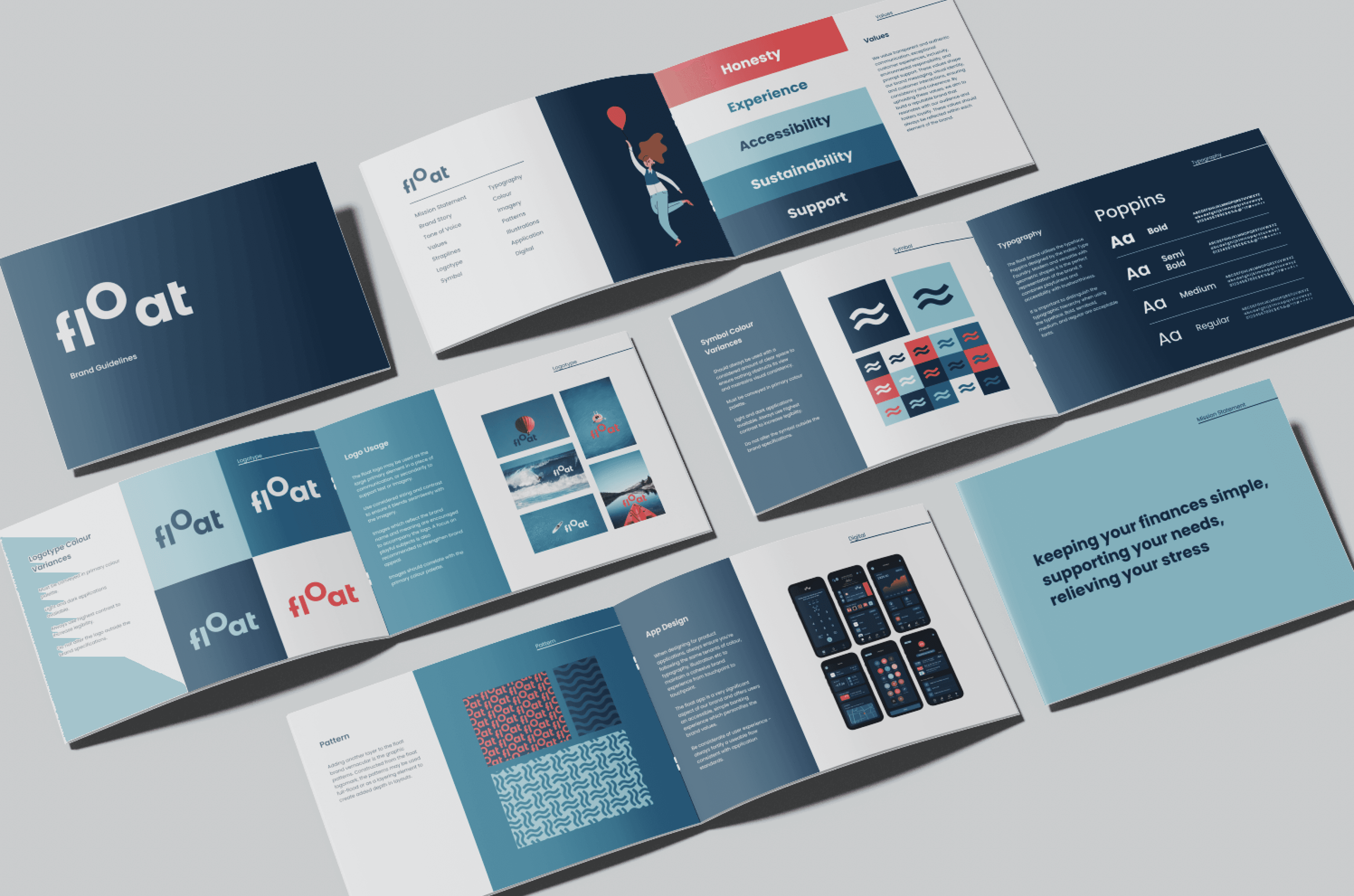
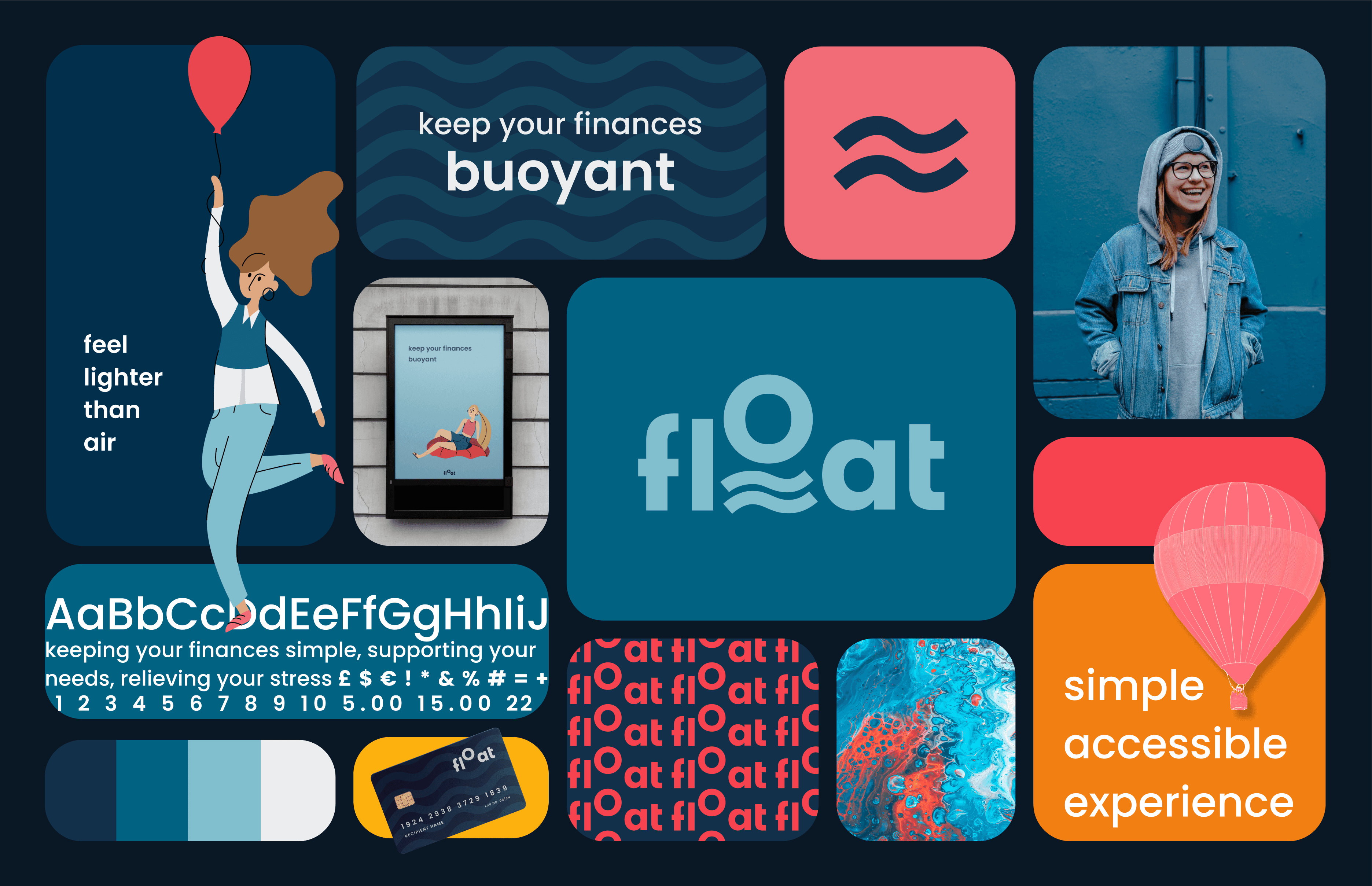
Next I designed a word mark and brand mark to represent the bank. Sketching and exploring ideas digitally enabled me to investigate a range of variables and determine a suitable outcome to reflect brand values. The result was a combined logo mark, which emits a modern feel and suggests the meaning of the brand name. It took considerable time with extensive sketching and refinement to design a logo mark that I was content fully reflected brand values.
brand development
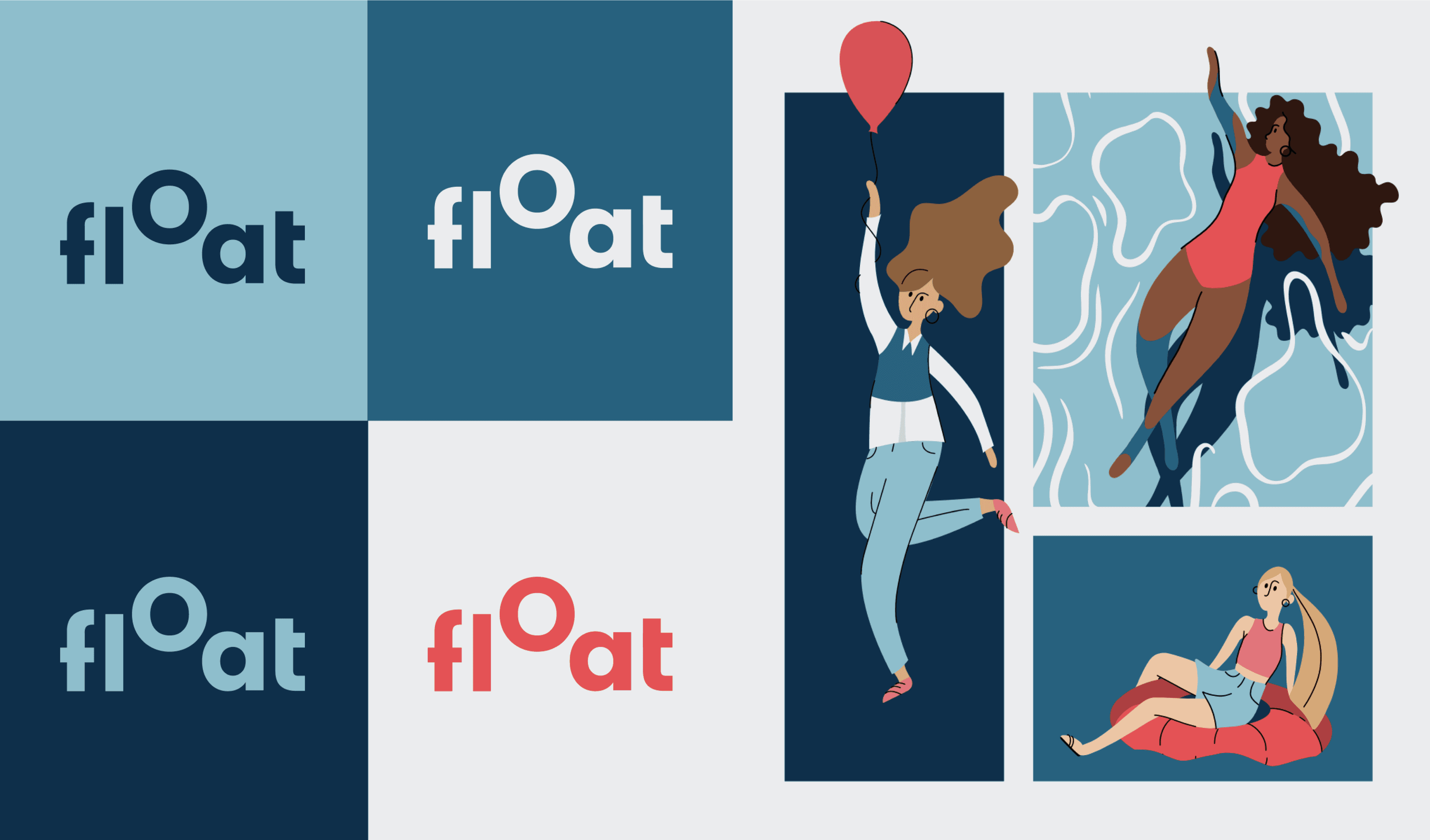
The colour palette I selected is playful and accessible with vibrant hues, conveying experience and trustworthiness to a younger target audience. Imagery, particularly illustrations are used to convey complex concepts, creating a unique visual style, which elicits a positive emotional response from users and aligns with the brand’s values.
banking app
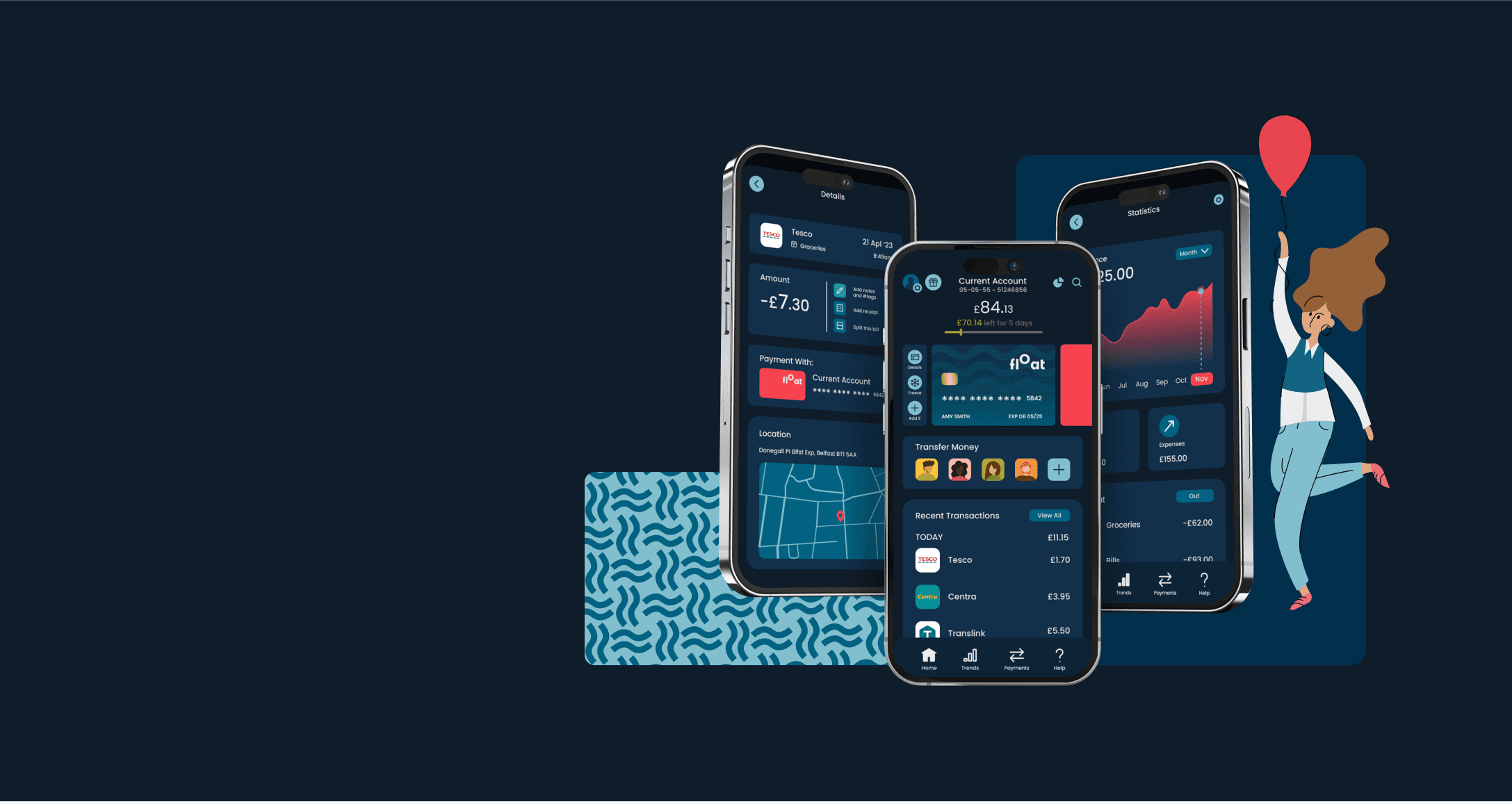
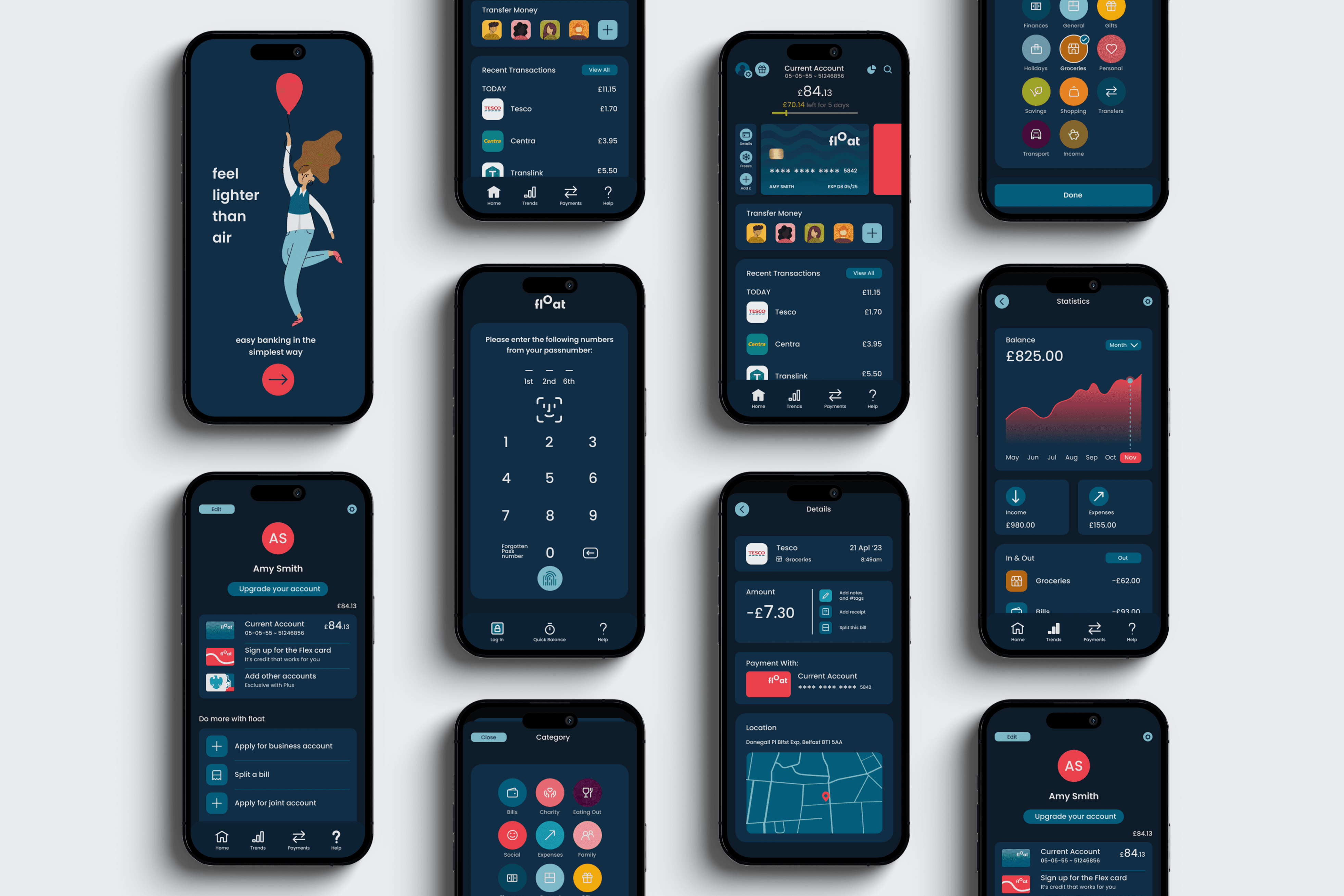
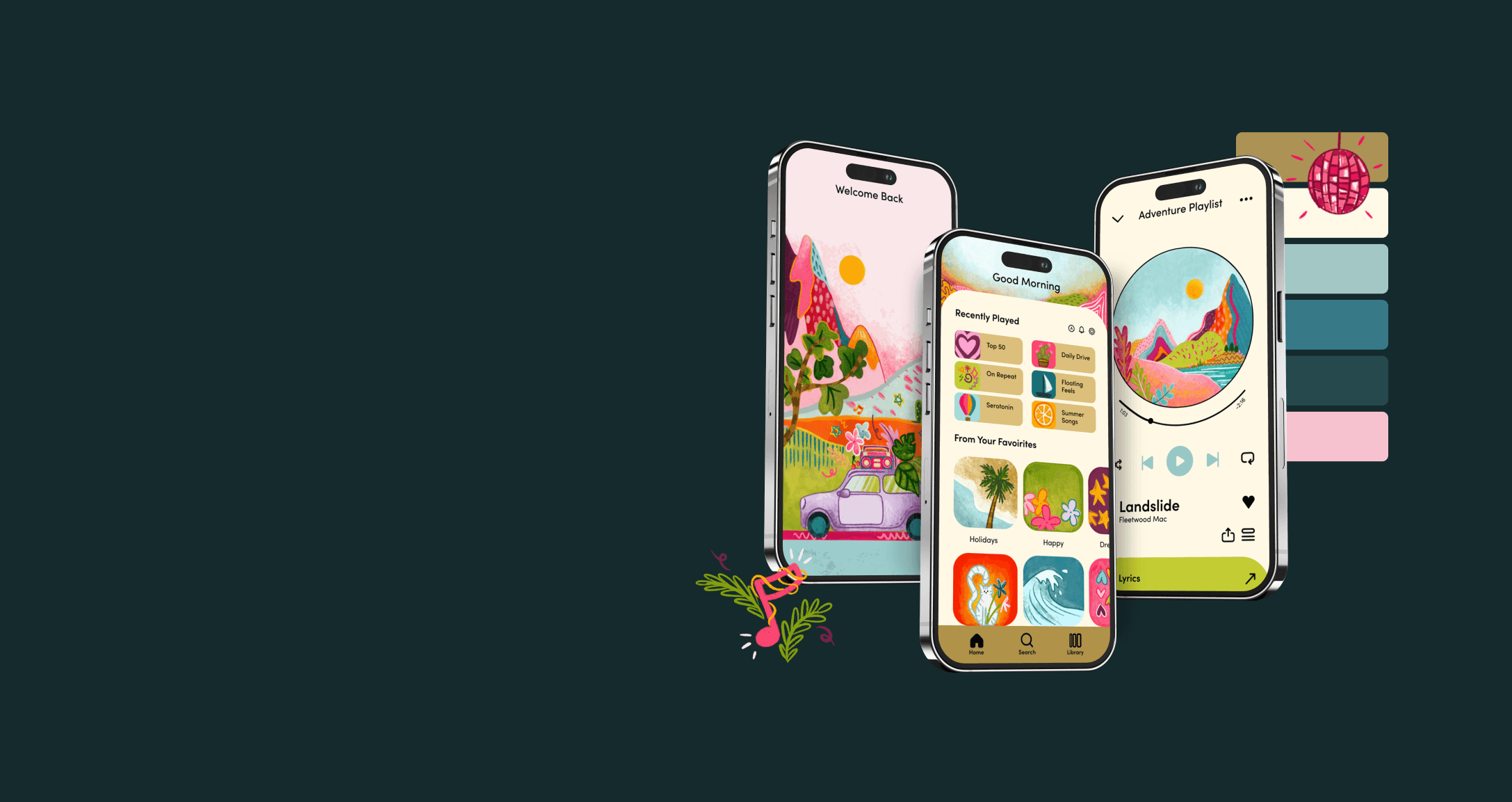
After exploring their success, I applied my brand to an existing UI using Monzo’s banking app as a foundation, making adjustments to suit the target audience and embedding the engaging visuals created.
brand guidelines
The final part of the process, involved compiling all aspects of the brand together to produce a brand guideline document.
reflection
This project has been an essential step in my growth as a designer, expanding my design skills and knowledge and pushing me beyond my perceived limits to develop creative solutions. Although it presented challenges, particularly in understanding the context, feedback from peers and exploration of design principles greatly facilitated the process. Incorporating vibrant colours and playful illustrations enhanced the brands appeal to the target audience and fostered an emotional connection.
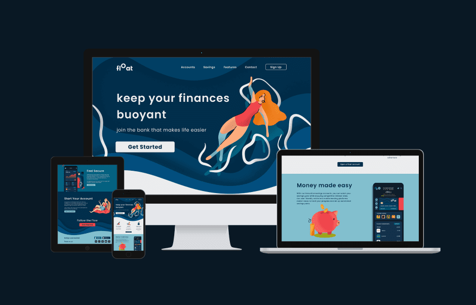
Designing the promotional landing page was one of the toughest parts, but led to significant improvements in highlighting the brand. If I were to revisit the project, I would explore this aspect further to achieve a design that communicates the brand in a more digestible format and engaging manner than I could within the project’s time constraints.
